8 Best Order Confirmation Email Templates for 2025
35 mins
5/26/2025
Joe Ervin
- order confirmation email templates
- email marketing
- ecommerce emails
- transactional emails
- email design
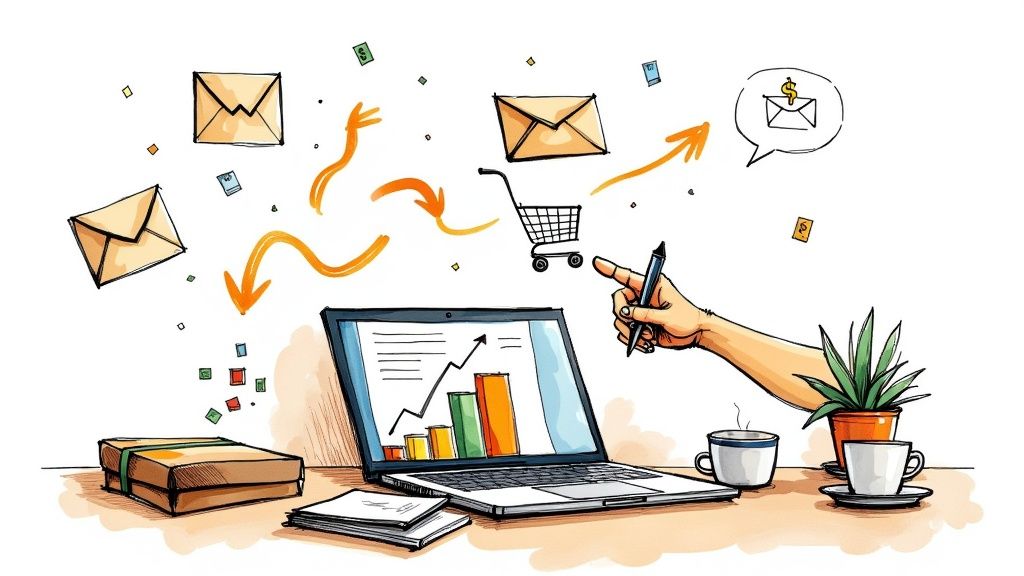
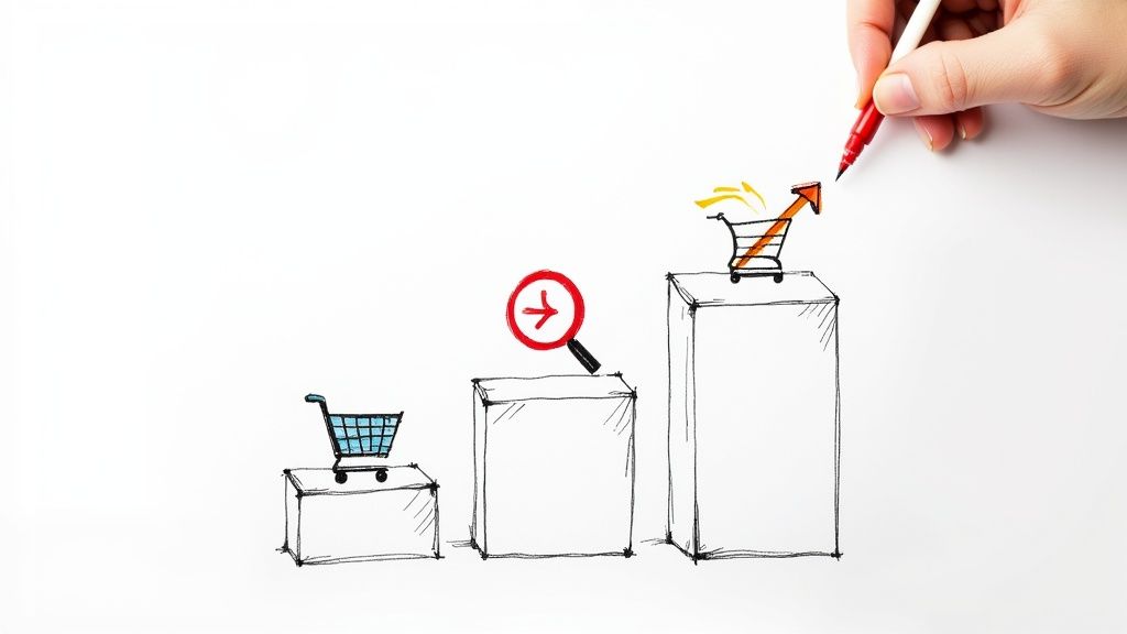
Make Your Order Emails Shine
When a customer buys, your order email is key. It’s more than a receipt. Good order confirmation email templates build trust. They can even bring more sales. This article explores 8 useful order confirmation email templates for your store. You'll see different types: simple updates, ones that show off your products, and others that can help you sell more or track shipping. Learn how to make your order emails work harder for your brand.
1. Standard Order Confirmation Template
The Standard Order Confirmation Template is the most common email you send after a customer buys something. Think of it as a digital receipt. It tells your customer, "We got your order!" This email is very important. It gives all the key facts about their purchase. The layout is clean and easy to read.
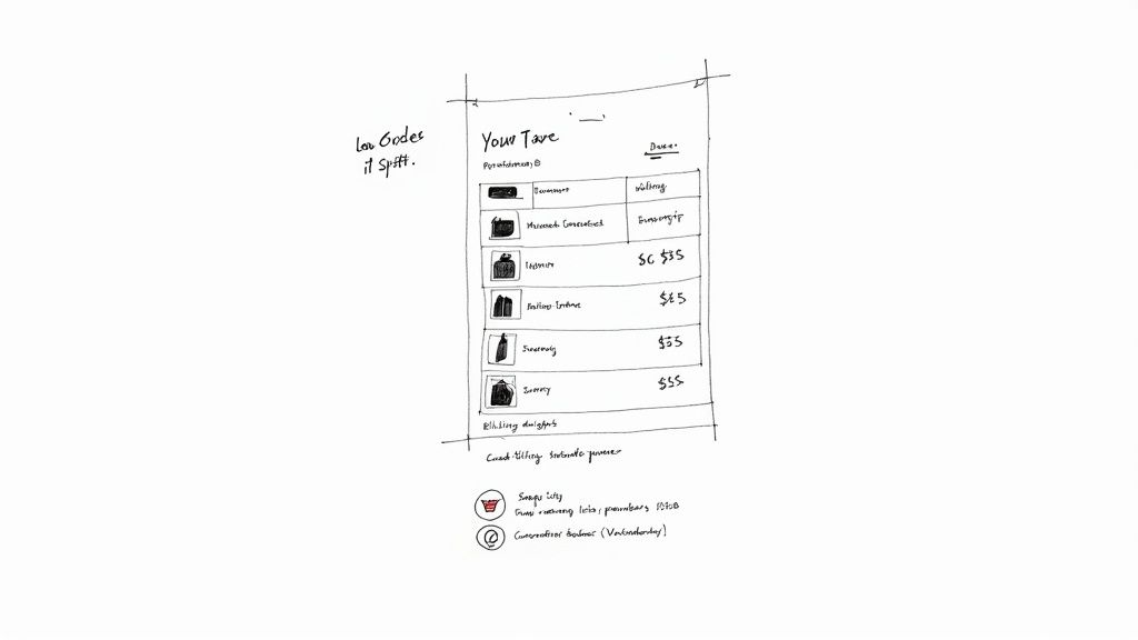
This template is number one on our list of order confirmation email templates for a big reason. It is the base for all good post-purchase communication. Almost every online store, from skincare brands to clothing shops, uses a version of this. Customers know this email. They expect to get it right after they click "buy." It helps them trust you. It answers their first big question: "Did my order go through?" Yes, it did, and this email shows all the details. For any e-commerce brand owner, this is the first and most vital email to perfect.
Core Anatomy: What’s Inside a Standard Order Confirmation Email Template?
This kind of email follows simple rules. It has a top part (header), a middle part with order details, and a bottom part (footer). Here are the key pieces you will always find:
Clear Header: This often has your store's logo. It helps customers know the email is from you.
Order Number and Date: These are usually big and easy to see. Customers use the order number if they need to ask questions or track their package. The date confirms when they bought it.
Itemized List: This is a list of everything the customer bought.
Product Images: Small pictures of each item help the customer see what they ordered. This can reduce mistakes.
Product Names: The full name of each item.
Quantities: How many of each item they bought.
Prices: The price for one item, and the total for that item if they bought more than one.
Totals: It will also show the subtotal (cost of items), any taxes, shipping costs, and the grand total amount paid. This makes costs very clear.
Billing and Shipping Addresses: The email clearly shows the address where the bill is sent. It also shows the address where the items will ship. Customers can check these to make sure they are right.
Payment Method Summary: It briefly tells how the customer paid (like Visa, Mastercard, or PayPal). For safety, it never shows the full credit card number. It might show the last four digits.
Estimated Delivery Date: This gives the customer an idea of when their package will arrive. This is very important for managing their hopes.
Customer Service Contact Information: Your email address, phone number, or a link to your help page should be easy to find. This is key if they have a problem or a question.
Footer Information: This area at the bottom might have links to your store's return policy, social media pages, or other useful info.
The Good Side: Pros of Using a Standard Template
Using these common order confirmation email templates has many good points:
Familiar and Expected: Customers are used to this style. They know what to look for and where to find info like the order number or total cost. This makes them feel calm and sure about their purchase.
Easy to Scan and Understand: The simple layout means customers can quickly find what they need. People are busy. They like emails that get straight to the point.
Works Well Across All Email Clients: These simple emails look good on computers, phones, and tablets. They work with Gmail, Outlook, Apple Mail, and others. This means your message gets through clearly, no matter how they read it.
Simple to Template and Automate: It is easy to set up these emails. Most e-commerce platforms (like Shopify or WooCommerce) and email marketing tools have ready-to-use standard order confirmation email templates. You can automate them to send right after a purchase. This saves you a lot of time.
Cost-Effective to Implement: You do not need to hire fancy designers or expert coders to create a standard confirmation email. This makes it a cheap and smart choice, especially for new or small businesses.
The Not-So-Good Side: Cons to Consider
However, this classic style is not perfect:
Can Appear Generic and Impersonal: Because so many stores use this format, your email might look like everyone else's. It might not feel very special or personal to the customer.
Limited Opportunities for Brand Differentiation: It is hard to show off your unique brand style with a basic layout. If your skincare or clothing brand has a very strong visual identity, this template might feel too plain.
May Not Encourage Additional Engagement: These emails usually just give facts. They do not often push customers to look at other products, read blog posts, or follow you on social media.
Lacks Interactive Elements: Modern emails sometimes have cool things like image carousels, videos, or review forms right in the email. Standard templates usually do not have these.
Who Uses It Well? Examples to Learn From
Many big companies use standard order confirmation email templates very well:
Amazon: Their confirmation emails are very direct. You see your order details right away. Items are listed clearly. Tracking is easy. Amazon proves that simple and fast information is what many customers want.
Target: Target’s order summary emails are also clean and easy to understand. You can scan them quickly. They use their red brand color, but the layout is standard and effective.
Best Buy: Best Buy sends emails that feel like a traditional store receipt. They often include specific details for electronics, which is helpful for their type of products.
These successful companies show that a well-made standard template gives all the needed information. This builds trust and makes customers feel less worried.
When and Why to Use This Approach
So, when should you use this type of template?
For Every Business: Every online store, no matter the size or type (skincare, clothing, etc.), must have this. It is the basic, must-do email after an order.
New or Small Businesses: If your brand is just starting, or if you do not have a lot of time or money for fancy email design, this is the best place to begin. It is easy and it works.
When Clarity is King: If your main goal is to give customers clear, correct information with no fuss, this template is perfect.
Why use it?
Meets Customer Expectations: Customers expect to get this email. Not sending one can make your business look unprofessional.
Builds Trust and Security: It shows you are a real, working business. It confirms their purchase. This makes customers feel safe about spending money with you.
Reduces Customer Service Questions: When all the order information is clear and easy to find, fewer customers will need to call or email asking "Where's my order?" or "What did I pay?".
Solid Foundation: This template is a strong starting point. You can always add more branding or marketing elements later as your business grows.
Make It Work for You: Actionable Tips
Even though it is standard, you can make your order confirmation email better:
Use Consistent Branding: Add your logo at the top. Use your brand’s main colors and fonts, even if it’s just for headings. This helps customers recognize your brand.
Include a Clear Call-to-Action for Order Tracking: Make a button or link that says "Track Your Order." Make it big and easy to click, especially on a phone.
Ensure Mobile Responsiveness: Many people will open this email on their phone. It must look good and be easy to read on a small screen. Test it on different devices.
Add Estimated Delivery Windows: Instead of just saying "June 10th," try "Expected Delivery: June 10th - June 12th." This is often more realistic and manages expectations better.
Include Customer Service Contact Prominently: Put your customer service email address and phone number where it is easy to see – maybe near the top or in the footer. Do not make customers hunt for help.
Where Did It Come From? (Popularized By)
This familiar format was made popular by:
Early E-commerce Pioneers: Companies like Amazon and eBay were some of the first big online sellers. They needed a simple, reliable way to confirm orders. They set the style that many still follow.
Traditional Retail Chains Transitioning Online: When big stores like Target or Best Buy started selling on the internet, they used this receipt-like email style. It was familiar to them and their customers from physical store receipts.
In short, the Standard Order Confirmation Template is a vital tool for any e-commerce brand. It is the trusty workhorse of order confirmation email templates. It delivers essential information, builds customer trust, and provides a solid, professional touchpoint right after a sale.
2. Visual Product Showcase Template
The Visual Product Showcase template turns your order confirmation email into a mini art gallery. It focuses on showing off the products your customer just bought. Think big, beautiful pictures. This email style continues the fun of shopping. It uses strong images to make customers feel good about their choice.

This type of order confirmation email template uses several key parts. You will see large, clear product photos. These are not tiny thumbnails. They are big enough to show detail. Some brands use image galleries. Customers can click through several views of their new items. Lifestyle images are also popular. These show products in use. For example, a sweater on a model or a coffee maker on a kitchen counter. Text is kept short. The pictures do most of the talking. The design often looks like an Instagram feed. It has lots of white space and clean lines. You might also see cool picture icons for shipping, returns, or help. These icons fit the visual style. They replace wordy links.
Using a Visual Product Showcase template offers great perks. It builds excitement. Customers see their new items in a good light. This makes them look forward to getting their package. It also shows the product's value and quality. Good photos make products look their best. These emails are often shared on social media. Happy customers might post a picture of their cool confirmation email. This is free advertising for you. This style also makes your brand look strong and stylish. Most of all, it helps stop buyer's remorse. Seeing the great items again confirms the customer made a good choice. This is a powerful feature for any order confirmation email.
However, there are some downsides to think about. Big images mean longer load times. If a customer has slow internet, the email might take a while to open. This can be frustrating. This style may not work well for services or digital items. It is hard to show a service with a big photo. Also, large email files can sometimes get caught by spam filters. This means some customers might not see your email. You need to balance beauty with function.
So, when should you pick this type of order confirmation email template? It is best for brands that sell physical products. Think clothes, beauty items, home goods, or cool tech gadgets. If your product looks good, show it off! This template is great if your brand has a strong visual style. It helps make your emails match your website and social media. This template earns its spot on our list because it does more than just confirm an order. It creates an experience. It turns a simple notice into a chance to delight customers. It reinforces their decision and builds loyalty. For brands where looks matter, this is a top choice.
Many famous brands use this style well. Apple sends sleek emails. They show off their new tech with clean photos. Nike uses images of athletes. This connects their gear to an active life. Warby Parker showcases its glasses. They often show them on different face shapes. Glossier uses bright, fresh photos for its beauty items. Other brands that helped make this style popular include fashion stores like Everlane and Reformation. Tech firms like Dyson also use stunning product visuals. Beauty giants like Sephora understand the power of a good product photo in their confirmations. These order confirmation email templates truly extend the brand's visual story.
To make this template work best for you, follow these tips. Make sure your images are ready for email. Use 72 DPI resolution. Compress the files to keep them small. This helps with load times. Always use alt text for your images. This helps people who use screen readers. It also shows text if images do not load. Include pictures even for small items like accessories. Every item matters. Test your emails on different email programs like Gmail or Outlook. This ensures your images look good everywhere. Keep your photo style the same. Use similar lighting and backgrounds for all product photos. This makes your emails look professional and cohesive. These details make your visual order confirmation email templates shine.
3. Minimalist Single-Column Template
A minimalist single-column template is a clean and simple design for your order confirmation emails. It shows only the most important facts. This design uses lots of empty space, also called white space. It also uses plain, easy-to-read letters, known as typography. This type of order confirmation email template puts clear facts first. It does not use fancy looks.
This template works by keeping everything neat and focused. All content, like text and images, lines up in one straight column down the page. This is key for mobile optimization, as it means your customers can read your order confirmation easily on their phones without pinching or zooming. Generous white space and padding (the empty area around your text and images) prevent the email from feeling crowded. This gives the eyes room to breathe and makes important details stand out.
The core features of this template style are:
Single-column layout: This ensures your email looks great and is easy to use on any device, from wide desktop screens to small mobile phones.
Generous white space and padding: This creates a clean, uncluttered feel, making the email easier to scan and digest.
Limited color palette: Most minimalist templates use only two or three colors, often a neutral base with one accent color. This keeps the focus on the information.
Simple, readable typography: Fonts are chosen for clarity, not for decoration. Standard, easy-to-read fonts ensure everyone can understand the message.
Essential information only: These templates cut out the fluff. They present only what the customer needs to know about their order: items purchased, total cost, shipping address, and estimated delivery.
Clear visual hierarchy: Proper heading structures (H1, H2, H3) and bold text guide the customer’s eye to the most important pieces of information quickly.
This template earns its place in any list of effective order confirmation email templates because it excels at its primary job: clearly and quickly confirming a purchase. After a customer buys from your clothing store, skincare line, or e-commerce shop, they want immediate reassurance. This template delivers that reassurance without distraction. Its simplicity builds trust and satisfaction right after the sale by making vital order details easy to find and understand.
Pros:
Excellent mobile experience: The single column adapts perfectly to smaller screens, where many people check their emails.
Fast loading times: Simple design means fewer elements, so the email loads quickly, even on slower internet connections.
High accessibility scores: Clean layouts and simple fonts make these emails easier for people with visual impairments or those using screen readers.
Easy to maintain and update: Fewer design elements mean less complexity when you need to make changes to your template.
Works consistently across email clients: Simple HTML is less likely to break or look strange in different email programs (like Outlook, Gmail, or Apple Mail).
Reduces cognitive load: Customers can find what they need without getting overwhelmed by too much information or too many visuals.
Cons:
May appear too basic for luxury brands: High-end brands might feel this style doesn’t reflect their premium image and may prefer more elaborate designs.
Limited space for additional marketing messages: The focus on essential information leaves little room for upselling, cross-selling, or other promotional content.
Less opportunity for brand personality expression: It can be harder to convey a unique brand voice or vibrant personality through such a stripped-down format.
May not stand out in crowded inboxes: Without bold colors or complex graphics, these emails might blend in more easily with other messages.
So, when and why should your brand use this approach for your order confirmation emails? This style is ideal if your top priority is clear, fast communication. If a large portion of your customers check emails on their mobile devices, a minimalist, single-column template is a very smart choice. It’s also a great fit if your brand aesthetic is modern, clean, and functional.
Use this approach if:
You want zero confusion about order details.
You know many customers will open the email on a phone.
Your brand values a modern, uncluttered look.
You want your emails to load quickly for everyone.
Making emails accessible to all users is important to your brand.
The main reason to use it is to enhance customer trust and reduce post-purchase anxiety. An easy-to-read order confirmation email makes customers feel secure about their purchase. This can lead to fewer customer service inquiries about order details, saving your team time and resources.
Many successful companies use this minimalist style for their order confirmation email templates. Stripe, the payment processing company, sends exceptionally clean payment confirmations. Basecamp, a project management tool, uses simple formats for its service confirmations. Mailchimp’s email receipts are straightforward and easy to understand. Medium’s subscription confirmations also follow this clean approach. These companies understand that for transactional messages like order confirmations, clarity and speed are paramount.
Here are some actionable tips to make this template work effectively for your brand:
Use a maximum of 600px width: This ensures your email content fits well on most screens without requiring horizontal scrolling, especially on mobile.
Stick to system fonts: Fonts like Arial, Helvetica, Georgia, or Times New Roman are widely available on most devices. Using them ensures your email looks consistent for all recipients.
Use bullet points and short paragraphs: Break down information into digestible chunks. This makes it easier for customers to scan and find what they need.
Test with screen readers: Ensure your email is accessible by testing it with screen reader software. This helps customers with visual impairments.
Include plenty of padding around clickable elements: Make sure buttons like "Track Your Order" or "View Invoice" have enough space around them so they are easy to tap accurately on a touchscreen.
Tech companies like Stripe and Slack helped make this clean style popular. Brands influenced by Scandinavian design, which values simplicity and functionality, also often adopt this look. Many tech startups focused on providing an excellent user experience also choose these minimalist order confirmation email templates to start the customer relationship off on a clear and positive note.
4. Cross-Sell Recommendation Template
The Cross-Sell Recommendation Template is a smart way to handle your order confirmation emails. It does more than just say "thank you for your order." This template also shows other items your customer might like. Think of it as a helpful follow-up. It confirms their purchase and gives them good ideas for more shopping. This makes it one of the most powerful order confirmation email templates you can use.
How does this template work? It's simple. The email starts with the most important news: the order details. Your customer sees what they bought, how much it cost, and where it is going. This part is clear and easy to find. Below this vital information, the email shows a few other products. These are not random picks. They connect to what the customer just bought. Or, they might be items the customer looked at on your site before. Some systems even show what other shoppers with similar tastes bought. This way, your email offers real value. It acts as a personal shopper, not just a receipt.
This type of order confirmation email template truly earns its place on any list of essential email formats. Why? People almost always open order confirmation emails. They expect them. They check them for accuracy. This high open rate means your product suggestions get seen. When customers see relevant ideas for other items they might need or want, they are often tempted to make another purchase. This template helps you increase sales. It also makes customers feel understood and valued by your brand. For skincare or clothing brand owners, this is a chance to showcase complementary products or accessories that complete a look or routine.
Key Features of This Template:
Order Confirmation First: All the crucial details of their recent order sit at the top. This part is prominent and easy to read.
"You Might Also Like" Section: A dedicated area displays these product suggestions. It might be titled "Customers also bought," "Complete the look," or "Pairs well with."
Personalized Picks: The items shown are chosen with care. They are based on the customer's current purchase, past browsing, or overall buying trends.
Related Accessories or Complements: The template can highlight items that naturally go with the main purchase. For example, if someone buys a skincare serum, you might suggest a moisturizer from the same line. If they buy a dress, you could show matching shoes.
Special Offers (Optional): You can include a small discount or free shipping offer for these additional recommended items. This can encourage an immediate second purchase.
Clear Visual Separation: The order details and the product recommendations are distinct. This visual separation ensures the email is easy to scan and understand. The main purpose – order confirmation – is never overshadowed.
Pros: Why Use This Template?
Increases Average Order Value (AOV): Customers often add one or two more suggested items to a new cart. This directly boosts how much each customer spends.
High Engagement Rates: Order confirmation emails have some ofthe highest open rates of any email type. Your recommendations get maximum visibility.
Personalizes the Customer Experience: Showing products a customer genuinely finds interesting makes them feel valued. It builds a stronger connection with your brand.
Maximizes Revenue from Existing Customers: You make more money from the people already buying from you. This is often easier and cheaper than finding new customers.
Provides Value: Good recommendations are helpful. Customers discover new products they need or will enjoy, improving their overall experience with your brand.
Cons: Potential Downsides to Consider
May Distract from Confirmation: If recommendations are too bold or placed incorrectly, they might overshadow the primary order details.
Can Appear Pushy: If suggestions are irrelevant or too aggressive, it can annoy customers. Thoughtful execution is key.
Requires Good Recommendation Logic: To be effective, recommendations should be truly personalized. This often relies on a recommendation engine or careful manual curation, which can be a resource commitment.
May Increase Email Complexity: More images and dynamic content can make emails slightly more complex to build, though most modern email platforms handle this well.
When and Why to Use This Approach
You should use this effective order confirmation email template if you sell multiple products. It is especially useful for e-commerce stores with a diverse catalog. For skincare brands, if a customer buys a cleanser, you can recommend a matching toner or moisturizer. For clothing brands, if someone purchases a shirt, suggest complementary pants, a skirt, or accessories.
Use this template to:
Grow Your Income: It’s a straightforward method to encourage additional sales.
Enhance Customer Service: You guide customers to other products they will find useful or appealing.
Build Customer Loyalty: A positive, personalized post-purchase experience makes customers happy. Happy customers are more likely to return.
Examples of Successful Implementation:
Amazon is famous for this. When you buy a product, they show "Frequently bought together" and "Customers who bought this item also bought."
Sephora excels at suggesting items to complete a beauty routine or makeup look. Buy a foundation, and they might recommend a suitable primer or brush.
Home Depot often suggests related tools or materials. If you buy a power drill, they might show drill bits or safety glasses.
Actionable Tips for Readers:
Confirmation is Priority: Always place the core order information prominently at the top of the email. Recommendations are secondary.
Limit Recommendations: Show just 3-4 relevant items. Too many choices can be overwhelming.
Use Behavioral Data: Leverage purchase history and browsing behavior for true personalization. The more relevant the suggestions, the better they perform.
A/B Test Your Approach: Experiment with the placement of recommendations, the number of items shown, and the call-to-action messaging. See what resonates best with your audience.
Include Social Proof: If possible, add customer reviews or star ratings for recommended products to build trust and encourage clicks.
Make it Easy to Buy: Ensure customers can easily click on a recommended product to view its page or add it to a new cart.
This template transforms a standard transactional email into a dynamic sales and customer engagement tool. For e-commerce brand owners looking to refine their email marketing, understanding how to implement cross-sell strategies is vital. You can Learn more about Cross-Sell Recommendation Template and other e-commerce email flows to further enhance your customer journey.
Popularized By:
This powerful email strategy was pioneered and popularized by e-commerce giants. Amazon led the way with its sophisticated recommendation algorithms. Their success demonstrated how data-driven suggestions could significantly increase sales. Other major online retailers quickly adopted similar tactics. Today, e-commerce platforms like Shopify and WooCommerce offer tools and integrations that make it easier for businesses of all sizes to implement these effective order confirmation email templates.
5. Timeline/Progress Tracker Template
What if your order confirmation email did more than just say "thanks for your order"? The Timeline/Progress Tracker template does exactly that. This is a special type of order confirmation email template. It shows customers precisely where their order is in the fulfillment process. It uses clear visuals, like a progress bar or a timeline. This helps customers see each step of their order's journey, from the moment they pay until it arrives at their door. This template changes a simple, one-time message into a helpful, ongoing conversation with your customer. It makes the waiting period feel more interactive and less uncertain.
This kind of email is a standout in the world of order confirmation email templates. Why? Because waiting for an order can make customers anxious. They might wonder, "When will my package arrive?" or "Is everything okay with my order?" This tracker email answers these questions before customers even need to ask. It calms their fears by providing transparency. It also makes your brand look professional and customer-focused. Using this template is a smart way to keep customers happy and informed after they make a purchase.
Key Features and Benefits
This dynamic email template comes packed with useful features:
Visual Progress Indicator: A graphical bar or a step-by-step timeline shows how far the order has progressed.
Clear Fulfillment Stages: It lists distinct stages such as 'Order Confirmed,' 'Processing,' 'Packed,' 'Shipped,' 'Out for Delivery,' and 'Delivered.'
Estimated Completion Times: It often provides estimated dates or times for when each stage will be completed or when the order will arrive.
Interactive Elements: Some advanced versions might include clickable elements for more details, though support varies across email clients.
Real-time or Near-Real-time Updates: The information reflects the most current status of the order.
Clear Next Steps and Expectations: It tells customers what will happen next and what they can expect.
These features lead to significant benefits for your business:
Reduces Customer Anxiety: Customers feel more at ease when they know their order's status.
Decreases Customer Service Inquiries: You will likely get fewer "Where Is My Order?" (WISMO) calls and emails, saving your team time.
Creates Anticipation and Engagement: Watching their order move closer builds excitement for its arrival.
Demonstrates Transparency and Professionalism: It shows your business is organized and values keeping customers informed.
Encourages Customers to Check Email Regularly: Customers are more likely to open your emails if they expect valuable updates.
Pros and Cons
Like any tool, the Timeline/Progress Tracker template has its advantages and some challenges:
Pros:
Happier Customers: It greatly reduces the stress that can come with waiting for a delivery.
Time Savings: Fewer support questions mean your customer service team can focus on other issues.
Builds Excitement: Customers enjoy tracking their purchase, which enhances their experience.
Enhanced Brand Image: Your brand appears more reliable and customer-centric.
Increased Email Engagement: Progress updates give customers a good reason to open and read your emails.
Cons:
Requires Backend Integration: You need a robust system to accurately track order statuses and feed this data to your emails.
More Complex to Implement and Maintain: Setting up and keeping these dynamic emails running can be technically demanding.
Can Highlight Delays: If your fulfillment process often has delays, the tracker will make these very visible, which could cause frustration if not managed well.
Limited Support for Interactive Elements: Not all email clients can display advanced interactive features perfectly.
When and Why to Use This Approach
This template is particularly effective for businesses that sell and ship physical products. If you are an e-commerce brand owner, a skincare brand owner, or a clothing brand owner, this is for you. If there is a noticeable waiting period between a customer placing an order and receiving it, this template is invaluable. Use it when you aim to significantly reduce WISMO inquiries. Employ this strategy when you want to offer a superior post-purchase customer experience.
Why should you adopt this method? This approach actively builds trust. Customers appreciate the openness about your order fulfillment process. It helps manage their delivery expectations effectively. Furthermore, it keeps them engaged with your brand even after they have completed their purchase. These advanced order confirmation email templates can be a true differentiator, showing customers you care about their entire journey, not just the initial sale.
Examples of Successful Implementation
Several well-known companies masterfully use timeline or progress tracker emails:
Food Delivery Services (e.g., UberEats, Domino's): These apps often show real-time updates as your food is prepared, cooked, and sent out for delivery. Domino's Pizza Tracker is a classic example, turning the wait into an engaging experience.
Shipping Companies (e.g., FedEx, UPS): These logistics giants pioneered package tracking, providing detailed updates as shipments move across regions.
Major Retailers and Tech Companies (e.g., Apple, Amazon): When you order a product, they provide a timeline from order processing through to shipping and final delivery.
These companies understand that keeping customers informed is key to satisfaction and loyalty.
Actionable Tips for Readers
To make your timeline/progress tracker emails truly effective:
Use Clear Icons and Visuals: Simple, intuitive icons for stages like 'shipped' or 'delivered' are easy to understand.
Provide Realistic Timeframes: Be honest about delivery times. It is wise to include a small buffer for unexpected minor delays.
Include Links to Detailed Tracking Pages: Offer a link to a webpage where customers can find more comprehensive tracking information if they wish.
Send Proactive Updates: Notify customers promptly via email when their order status changes. Do not make them wait for the news.
Design Fallbacks: Create a simpler, static version of the email for email clients that do not support interactive elements. This ensures all customers receive the key information.
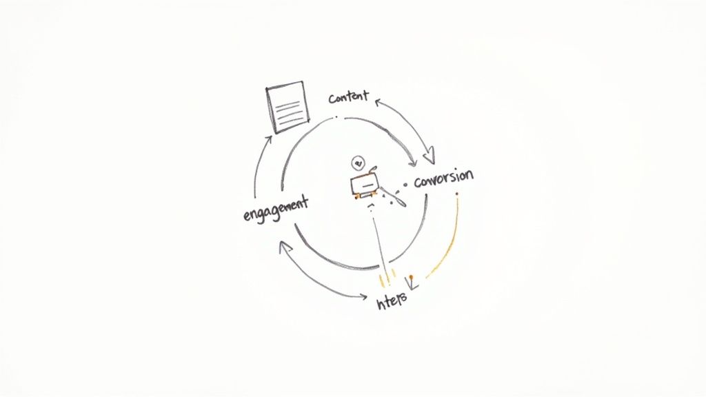
A great Timeline/Progress Tracker keeps customers opening your emails. This high engagement creates chances for more than just updates. Once you have their attention with helpful order confirmation email templates, you can guide them to other products they might love. The timeline below shows an example of a "Cross-Sell Recommendation Email Journey." This journey starts right after the first order confirmation. It shows how to keep talking to your customer in a smart way to build a stronger relationship and potentially increase sales.
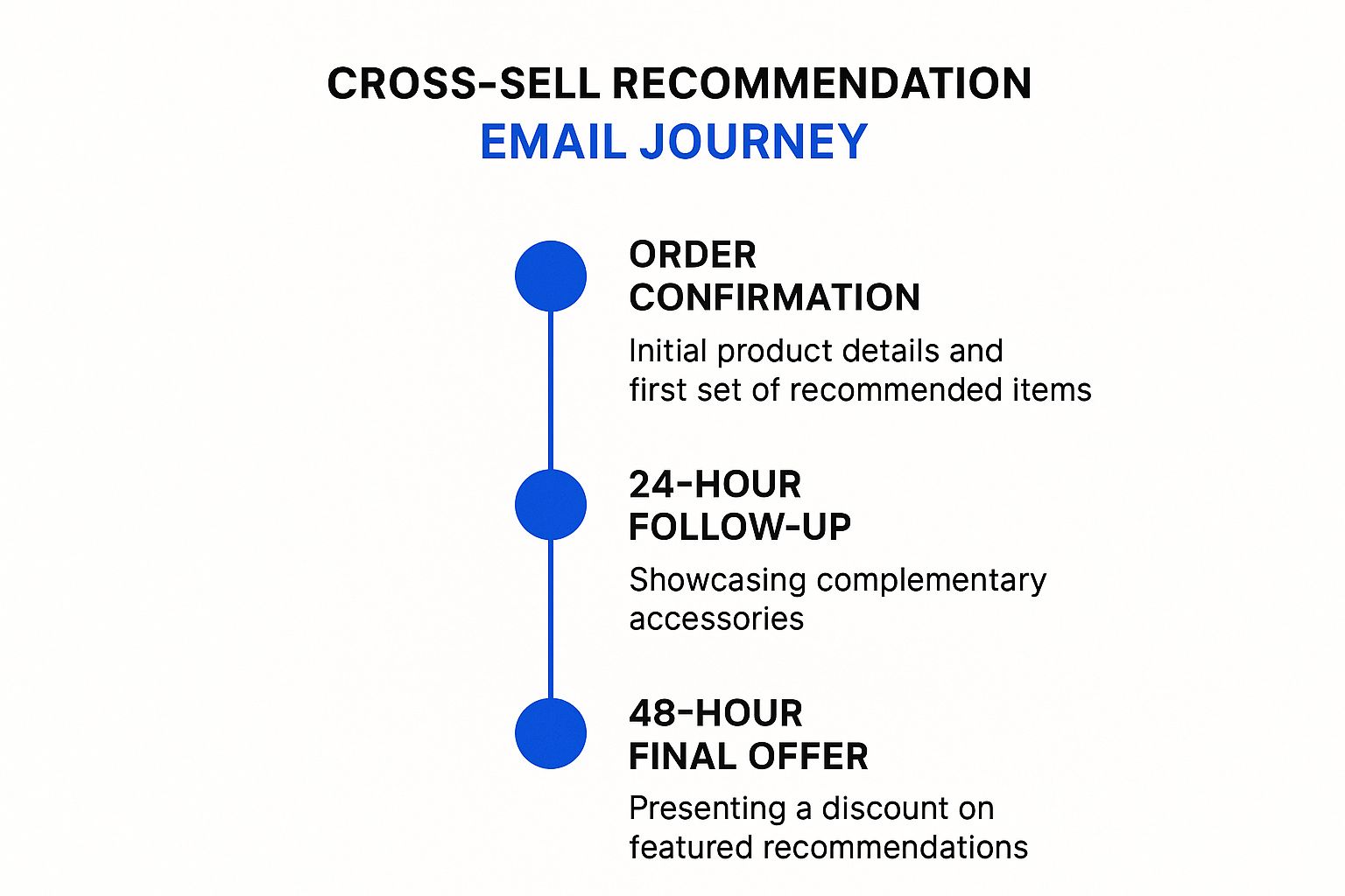
This infographic outlines a three-step plan for post-purchase engagement. First, the initial order confirmation email also includes a few thoughtfully recommended products. Then, a follow-up email, sent 24 hours later, showcases accessories or items that complement the customer's recent purchase. Finally, an email sent at the 48-hour mark presents a special offer or discount on these featured recommendations. This strategic journey demonstrates how order confirmation emails can be the starting point for turning a one-time buyer into a loyal, repeat customer by offering continued value.
6. Social Proof and Review Request Template
This type of order confirmation email does more than just say "thanks for your order." It uses what other happy customers say to build trust. It also gently asks new buyers to share their own thoughts. This helps you get more reviews. Many brands find this a key part of their order confirmation email templates.
How does it work? People trust other people more than ads. When a buyer sees good reviews or happy customer photos right in their order email, they feel good. They see others liked the product. This makes them trust your brand. Then, when the time is right, the email asks them to leave a review. This template taps into the happy feeling a customer has right after buying.
This template is a smart choice for your order confirmation email templates. It helps new brands build trust fast. For online stores, like skincare or clothing shops, buyers cannot touch or try items first. Seeing good words from real users helps them feel sure they made a good choice. It also turns happy customers into your best sales team by getting user-generated content (UGC). This is why it earns its spot on any list of effective order confirmation email templates.
Key Features to Include:
What makes these order confirmation email templates special? Look for these parts:
Customer Testimonials and Reviews: Show real quotes from happy buyers. For example, a skincare brand might show, "This face cream made my skin so soft!" A clothing brand could feature, "I got so many compliments on this dress!"
Star Ratings and Review Snippets: Show stars, like 4 or 5 stars, next to products or the brand name. People see these fast. A short, positive line from a review adds power.
Social Media Integration and Sharing Buttons: Add buttons to share on Instagram, Facebook, or Pinterest. Make it easy for buyers to show off their new items or share their good experience.
Request for Product Reviews or Photos: Include a clear, friendly call to action. A simple line like, "Love your new shirt? Share a photo or write a review!" works well.
User-Generated Content Showcase: Put photos from other customers using your items in the email. This shows your products in real life and makes new buyers keen to share too.
Community Engagement Elements: Invite people to join your Facebook group, follow your Instagram, or use a special hashtag. This helps them feel part of your brand family.
Pros: The Upsides of This Approach
Using social proof in your order confirmation email templates has big pluses:
Builds Trust Through Social Validation: New buyers see that others bought and liked your product. This makes them trust you more, especially if they are first-time customers.
Encourages Positive Review Generation: When people see good reviews, they are more likely to leave one too. Asking at the right time, when they are happy with their purchase, boosts this.
Increases Social Media Engagement: Easy share buttons mean more people might post about your brand. This is free word-of-mouth marketing.
Provides Fresh Content for Marketing: Reviews and customer photos are great for your ads, website, and social media. It is fresh, real content you did not have to create from scratch.
Strengthens Brand Community: When customers share and see others share, they feel connected to your brand and other buyers. This can lead to loyal fans.
Cons: Things to Keep in Mind
There are a few things to watch for:
Risk of Highlighting Negative Reviews: If you show all reviews, some might be bad. You must be ready to reply to these well and learn from them.
May Overwhelm the Confirmation Message: The main job of the email is to confirm the order. Do not let reviews and social proof make the email too long or busy. Keep the order details clear and easy to find.
Requires Ongoing Content Curation: You need to find and add new, good reviews often. This takes time and effort.
Depends on Having Sufficient Review Volume: If you are a new brand and have very few reviews, this template might not work well yet. Focus on getting those first reviews first.
Examples of Success:
Big companies use this idea well in their communication, often linked to confirmations:
Airbnb: After a stay, both guests and hosts review each other. Their emails prompt this. This system builds trust for future bookings.
Etsy: Reviews are key for Etsy sellers. Buyers see seller ratings. Order follow-up emails often ask buyers to rate their purchase.
TripAdvisor: This site is all about reviews. When you book something, their emails often ask you to review your experience later.
Yelp: For food orders or restaurant bookings, Yelp uses reviews. Their confirmation or follow-up emails can also show reviews or ask for one.
These platforms expertly weave social proof into their customer journey, often starting with messages linked to order confirmation email templates.
Actionable Tips for Readers:
To make these social proof order confirmation email templates work best for your brand, try these tips:
Time Review Requests Appropriately: Wait until the customer gets the item and has time to use it. For skincare, maybe wait a week so they can see results. For clothes, ask soon after delivery.
Showcase Diverse, Authentic Testimonials: Use different types of reviews from real people. Do not use fake ones; customers can often tell.
Make Sharing Easy with Pre-populated Social Posts: If you want them to post on social media, give them ideas. You could even offer a sample post they can edit and use.
Offer Incentives for Honest Reviews (Optional): You could offer a small discount on their next order for an honest review. Or enter them in a prize draw. Make sure to ask for honest reviews, not just positive ones.
Curate Reviews to Match Customer Demographics: If a customer bought a product for sensitive skin, show reviews from others with sensitive skin. This makes the social proof more relevant.
Building a strong connection from the start is vital for customer retention. Social proof elements in your emails can help with this. You can Learn more about Social Proof and Review Request Template and see how these ideas fit into a wider email strategy, such as your welcome series.
When and Why to Use This Approach:
Use this type of order confirmation email template when you want to:
Build strong trust with new and returning buyers.
Get more people to write reviews and share their experiences.
Grow an active community around your brand.
Get real photos and stories from users for your marketing.
Why use it? It turns a simple "order confirmed" message into a chance to connect deeper. It shows new customers that other people like them love your products. This is very helpful for online stores. If you sell items like skincare or clothing, where people cannot try before they buy, social proof is like gold. It helps buyers feel good about their choice and encourages them to come back for more. These specialized order confirmation email templates help turn a one-time buyer into a loyal fan and advocate for your brand.
7. Multi-Language/Localized Template
Imagine you sell your cool clothes or skincare products to people all over the world. You want your "thank you for your order" email to feel personal to each customer. This is where a Multi-Language/Localized order confirmation email template shines. It's a smart email. It changes itself to fit who is reading it.
What Is It and How Does It Work?
This kind of template is like a chameleon. It changes its look and words based on your customer. If a customer is in France, they get an email in French. If they are in Japan, they get it in Japanese. It's not just about words. The email can show prices in their own money, like Euros or Yen. It can also show pictures or colors that people in their country like.
How does it do this? The system looks at the customer's location. Or, it might know their preferred language from their account settings. Then, it picks the right parts to build the email. So, a person in Spain sees an email in Spanish, with prices in Euros. They might also see shipping info just for Spain. This makes your brand feel close and caring. It's a big step up from sending the same email to everyone. This approach is a core part of advanced order confirmation email templates designed for a global reach.
Key Features and Their Big Wins
These special templates have parts that make them work so well:
Dynamic Language Switching: The email speaks your customer's language. This is huge. People understand things best in their own tongue. It means fewer mistakes and happier customers.
Local Currency and Pricing Display: No more guessing how much something costs. Showing prices in their money (like dollars, pounds, or pesos) makes it easy. This builds trust.
Region-Specific Shipping Information: Shipping rules and times change by country. This template can show the right shipping facts for each customer's home. This means they know when to expect their order.
Cultural Adaptation of Imagery and Messaging: Pictures and words can mean different things in different places. This template can change images or phrases to be friendly and right for each culture. Maybe red is a lucky color in one place but not another. The email can adapt.
Local Contact Information and Support Hours: If a customer has a question, they want local help. This email can show a local phone number or support hours for their time zone. This makes help easy to get.
Compliance with Regional Regulations: Different places have different rules (like GDPR in Europe). This template can include the right legal bits for each region. This keeps you safe and shows you respect local laws.
Why Use This Approach? When Is It Right for You?
You should use this template if you sell to people in many countries. Or, if you plan to grow your business worldwide. For e-commerce shop owners, especially in fashion or skincare, making customers feel understood is key.
Think about it. If a customer gets an order email in a language they don't know well, they might feel lost. They might worry if their order is right. But an email in their own language, with local money, makes them feel safe. They trust you more. This leads to more sales and loyal fans. It shows you are a world-class brand that cares. When you want your order confirmation email templates to truly connect, this is the way.
Examples of Big Brands Doing It Right
Many large companies use these smart emails:
IKEA: When you order from IKEA online, your confirmation email feels like it came from your local store. It's in your language and has info for your area.
McDonald's: If you order food on their app, the email confirmation is often tailored to your country or region.
Booking.com: This travel site sends confirmations in many languages. All your trip details are clear, no matter where you are from.
Spotify: Your music subscription emails from Spotify often match your country, with local offers or terms.
These big names know that talking to customers in their own way works.
The Good (Pros):
Feels Personal: Customers feel like you know them.
Easy to Understand: Clear words mean fewer problems.
Shows Respect: You care about their culture.
Makes Customers Happy: Happy customers buy more.
Helps You Grow: You can sell in more countries.
The Not-So-Good (Cons):
Hard to Set Up: It takes a lot of tech work.
Needs Constant Care: You must keep translating and updating.
Costs More: More work means more money to run.
Mistakes Can Happen: Bad translations can confuse people.
Letter Issues: Some languages have special letters that can be tricky for computers.
Actionable Tips for Your Brand
If you want to use these powerful order confirmation email templates, here are some tips:
Use Real Translators: Do not just use free computer tools for important text. Pay people who speak the language well. They know the culture too.
Test with Native Speakers: Before you send emails, ask people from that country to read them. They can find mistakes or things that sound odd.
Think About Culture: Colors, pictures, and even jokes can be different. Learn what people in each place like.
Offer Local Help: Give customers ways to contact you that are easy for them. This might be a local phone number or chat in their language.
Check Character Encoding: Make sure all letters and symbols show up right on all devices. This prevents garbled text.
This multi-language template is a top choice for businesses that think big. It shows you are serious about serving customers everywhere. While it takes more effort, the rewards can be huge. It can make your customers feel truly valued.
8. Interactive/AMP Email Template
Meet a very new kind of email: the Interactive/AMP Email Template. Think of it as a super-powered message for your customers. It uses special tech called AMP (Accelerated Mobile Pages). This tech puts small, active parts of a website right into your order confirmation email templates. What does this mean? Your customers can do things – like update an address or track a package – without ever leaving their email. It changes a flat, boring order note into a live, helpful experience. These order confirmation email templates are a big step up from old, static messages.
How does this work? AMP for Email uses a special kind of code. This code lets you add interactive bits, like buttons that change things or forms that can be filled out, directly into the email’s body. When a customer opens an AMP email in a supported email client (like Gmail or Yahoo Mail), these interactive parts work just like they would on a webpage. It is like having a mini app inside the email.
Why Interactive/AMP Templates Belong in Your Strategy
Interactive/AMP order confirmation email templates earn their place because they make the post-purchase time better for buyers. After someone buys from your clothing or skincare store, they look for their order confirmation. An interactive email can give them more than just facts. It can let them act.
Imagine a customer just bought a new dress. Your AMP order confirmation email could let them:
Click a button to see styling tips in an image carousel.
Quickly add a matching accessory they forgot.
Choose a preferred delivery window from a calendar.
All this happens inside the email. This ease makes customers happy. Happy customers trust your brand more and may buy again.
Key Features That Shine:
These templates offer powerful tools for your order confirmation email templates:
In-email interactive forms and buttons: Customers can confirm delivery details, reply to a quick survey about their order, or even initiate a return/exchange process without opening a new tab. For a skincare brand, a customer could use a form to adjust their next subscription delivery date.
Real-time content updates: Show live order tracking status directly in the email. The information updates each time they open it. No more clicking out to a carrier’s confusing website.
Embedded calendars and booking systems: If your product needs setup or a special delivery, let customers pick a time slot from a calendar within the email.
Interactive carousels and image galleries: Show related products that complement their purchase. A clothing brand could display "ways to wear" their new item. A skincare brand could show other products in the same line.
Live pricing and inventory updates: Offer a last-minute add-on with real-time stock information. "Add our best-selling cleanser for 10% off – only 3 left!"
In-email customer service chat widgets: If a customer has a quick question about their order, they can start a chat with your support team directly from the email. This offers instant help and reduces frustration.
Pros: The Upsides
Using interactive order confirmation email templates offers big wins:
Much Higher Engagement: People are more likely to click and interact with these emails. This makes your emails more effective.
Less Customer Effort: Customers can do things faster. They don’t need to visit your website for simple actions, which means less friction.
Memorable Brand Moments: These modern emails make your brand look smart and customer-focused. It creates a "wow" factor.
Complex Actions Made Simple: You can guide users through processes like scheduling or customizing, all within the familiar inbox.
Future-Proofs Your Emails: This technology is forward-thinking. Using it now puts your brand ahead of the curve.
Cons: The Downsides
There are some challenges with these advanced templates:
Limited Email Client Support: AMP emails work best in Gmail, Yahoo Mail, and Mail.ru. Other email clients will show a fallback HTML version.
Needs Advanced Tech Skills: Building AMP emails requires special coding knowledge. It's more complex than standard email design.
Longer to Build and Test: Creating and thoroughly testing these emails takes more time and resources.
May Not Work for Everyone: If a large part of your audience uses email clients that don't support AMP, they won't see the interactive features.
More Complex, More Bugs: With more interactive parts, there's a higher chance of something not working as expected. Testing is key.
Examples in Action
See how top brands use this idea:
Pinterest: Lets users save Pins or discover new ideas directly within emails. Imagine your order confirmation allowing customers to save items to a "wishlist" board.
Booking.com: Allows users to manage aspects of their reservation from the email. Your store could let customers modify order details or add gift wrapping.
Doodle: Enables poll participation within the email. For an order, you could ask for feedback on the purchase experience right away.
Google: Offers interactive flight check-in or event RSVPs. Your order confirmation could let customers track their package with live updates inside the email.
These advanced order confirmation email templates can truly change how customers feel after a purchase. If you're looking to enhance this part of your sales process and explore how technology can help, you might Learn more about Interactive/AMP Email Template and the broader strategies around it.
When and Why to Use This Approach
Use interactive order confirmation email templates when:
You want to significantly boost post-purchase engagement.
Your products have options for add-ons, customization, or scheduling (e.g., delivery for large items, setup for tech).
Your customer base largely uses AMP-supporting email clients like Gmail.
You have the technical team or resources to build and test AMP emails.
For clothing brands, this could be showing related items or gathering quick feedback on style preferences. For skincare brands, it could be an easy way to manage subscriptions or reorder.
Tips for Success
Always Have a Fallback: Create a standard HTML version of your email. This ensures everyone gets the key info, even if they can't see the AMP effects.
Start Simple: Begin with one or two interactive features, like an in-email tracking button or a simple feedback form.
Test, Test, Test: Check your AMP emails across all supported clients (Gmail, Yahoo, etc.) on desktop and mobile.
Mobile-First Design: Most people open emails on their phones. Ensure your interactive elements are easy to use on small screens.
Track Your Results: Monitor open rates, click-through rates, and interaction rates on your AMP elements. See what works best.
Popularized By
Google created AMP technology. Email marketing leaders like Litmus and innovative, tech-forward brands are pushing its use to create richer email experiences. Adopting interactive elements in your order confirmation email templates signals that your brand is modern and values customer convenience.
Order Confirmation Email Template Comparison
Template | Implementation Complexity 🔄 | Resource Requirements ⚡ | Expected Outcomes 📊 | Ideal Use Cases 💡 | Key Advantages ⭐ |
|---|---|---|---|---|---|
Standard Order Confirmation | Low | Low | Reliable, clear order details, low engagement | Simple product businesses, general e-commerce | Familiar format, easy to automate, cost-effective |
Visual Product Showcase | Medium | High | Strong brand impression, increased excitement | Fashion, beauty, lifestyle, premium product brands | Enhances product appeal, shareable, reduces remorse |
Minimalist Single-Column | Low | Low | Fast loading, high readability, mobile optimized | SaaS, subscriptions, brands valuing simplicity and UX | Excellent mobile experience, accessible, lightweight |
Cross-Sell Recommendation | Medium-High | Medium-High | Increased average order value, personalized upsell | E-commerce with diverse catalogs and customer data analytics | Boosts revenue, personalizes experience |
Timeline/Progress Tracker | High | High | Reduced anxiety, fewer support requests, strong engagement | Complex fulfillment, time-sensitive or custom orders | Transparency, engagement, proactive communication |
Social Proof & Review Request | Medium | Medium | Builds trust, encourages reviews and social sharing | Marketplaces, experiential services, trust-driven brands | Strengthens community, generates content |
Multi-Language/Localized | High | High | Global relevance, increased trust, better satisfaction | International businesses, global e-commerce | Personalized global communication |
Interactive/AMP Email | Very High | Very High | Significantly higher engagement, seamless interactions | Tech-savvy brands, SaaS, innovators | Highly engaging, reduces friction, dynamic content |
Pick the Best Email for Your Store
You saw eight good order confirmation email templates. Each one has a job. Some show your cool items. Some ask folks to share what they think. Others just tell the facts.
The main thing is this: good order confirmation email templates make buyers feel good. Happy buyers often shop again.
What now?
Pick a template that fits your store.
Test it. See what your buyers like.
If you want help, Trace branding can make your emails even better. We help stores like yours. We build email systems. These systems bring more repeat buyers. They also bring steady sales. We turn your emails into money, fast.
Using the best order confirmation email templates is smart. They help you connect with buyers. They can bring more sales. They build a strong brand.
Go on, pick a template. Make your order emails great!